
Computational · Geospatial
Manhattan Transit Accessibility Mapping
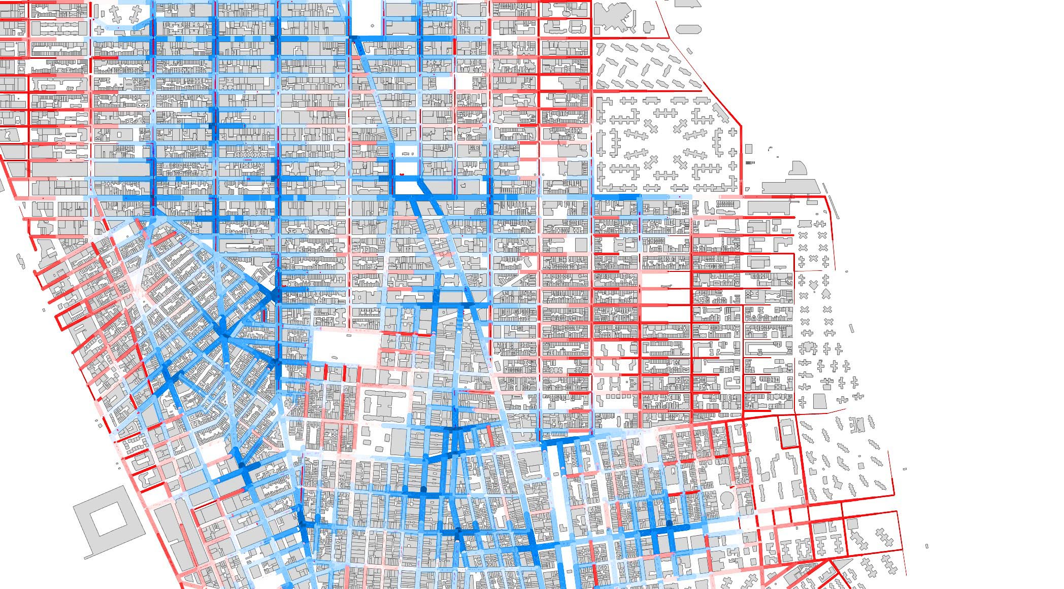
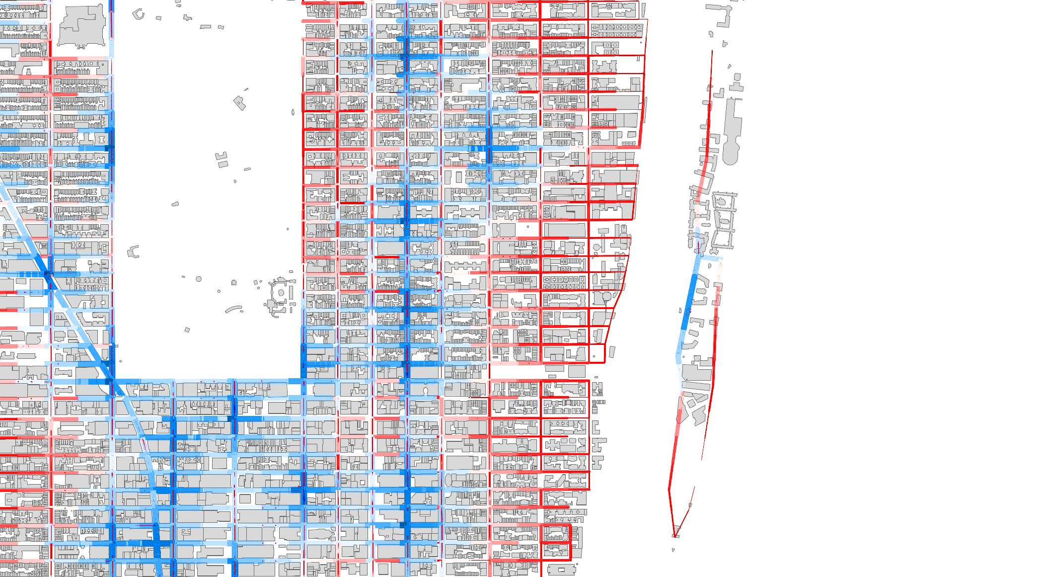
Walking time from every building in Manhattan to its nearest subway station, calculated by shortest-path analysis over the pedestrian street network and mapped across the island.
Flow chart & Grasshopper script


Datasets

Five public datasets feed the model:
| Subway station locations (GeoJSON) | NYC.gov 3D Model by Community District · station points |
| Pedestrian street network | OpenStreetMap · graph for distance calculation |
| Building footprints (GeoJSON) | NYC OpenData Buildings · building geometry |
| Building height (CSV) | NYC OpenData Buildings · building geometry |
| Building volume (CSV) | NYC OpenData Buildings · weighted floor-area average |

Process
Distance calculation (street network only)
The streets are converted into a weighted graph, where nodes are intersections, edges are street
segments, and each weight is the segment length. Each building centroid is snapped to the nearest
street and assigned to a graph node
v_b, and each station is snapped and assigned to a
node v_s. Distance is computed only along the street network using the shortest path:
Distance
d(b, s) = Σ L_e over the edges in the shortest path (v_b → v_s).

Nearest station per building
A multi-source shortest path is run from all station nodes, and each building is assigned to its
nearest station
s* = argmin_s d(b, s). The shortest-path edges are extracted and
allocated to that building, and edge-usage counts are aggregated to give each street a “flow”
intensity.
Coloring
Streets vary in thickness by edge flow and are colored by nearest-station catchment or flow intensity;
buildings are colored by distance to their assigned station.
Outcome & statistics

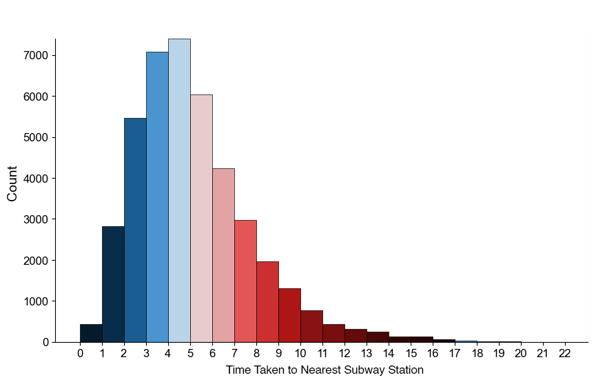
| Average walking time | 5.132 min |
| Median walking time | 4.687 min |
| Maximum walking time | 21.18 min |
| Under 5 min | 55.40% |
| 5 to 10 min | 39.45% |
| Over 10 min | 5.15% |
Regional analysis

Lower Manhattan has the highest concentration of subway stations, while the East Village has the
lowest. Almost every building in the Financial District is within three minutes of a station, while
the majority of buildings in the East Village require up to twenty minutes.

Midtown shows a clear contrast between the densely served central area and the less connected
waterfront. Because stations concentrate in the commercial districts, residential zones are
underserved for transit access.

Upper Manhattan shows the most even distribution of stations. The majority of buildings are within
fifteen minutes of a station, even those closer to the waterfront.